Has D&D Beyond Maps ruined D&D maps?

D&D's virtual tabletop seems to be driving the art direction for even the print version of dungeon maps in adventures. And the quality and table usefulness has suffered.
Someone on Discord noted in their review of the print edition of Deadfall, the new adventure from D&D publisher Wizards of the Coast, the maps were small and hard to read. I have not purchased Deadfall, but I had the same complaint about the recent Ravenloft: The Horrors Within expansion book.
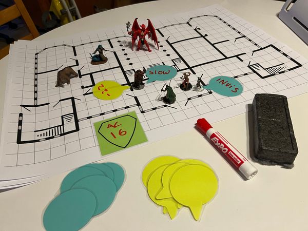
A bit of a preface here: When running D&D adventures from a book, I do what DMs have done since the 1970s, I look at the printed adventure, with all the secrets that I don't show my players, and turn-by-turn I refer to it and draw the dungeon before them. I have a dry-erase mat, or use my dungeon tiles, or I describe it to the players and have them draw it as they make every turn.
Pretty pictures in a color-rendered map, with lighting effects, textured stone floors, altars studded with colorful gems... those aren't useful to me, because the players will not be seeing MY book. It has the SECRETS in it– the traps, the secret doors, the clues to the treasure.
What I need is a CLEAN map. An easy to read map with my details clear and legible. Because I'm referring to it dozens of times in a session. An overly busy, small, dim, hard-to-read map is useless to me.
On the other hand, a map with no detail to explore is also useless to me. Just describe in the adventure "a straight empty trail with 10' embankments on either side and no other distinguishing features" is perfectly fine. I don't need a graphic to go along with that.
(The Straight featureless trail I refer to is illustrated, uselessly, on page 68 of the print edition of "Arcana Unleashed: Deadfall")
I can understand if you're running a game on a VTT, you NEED that featureless trail so that the scene you need can happen somewhere, and not on an empty background. If you bought the virtual version of the product, that illustration is useful on the VTT. But an illustration of a featureless trail in a book just takes up space. Just say "10' wide dirt trail with 10' embankments".
If you don't play like this, physically, pen and paper, straight from the book, you may not understand this way of playing. But it's WHY I buy the book and not the digital VTT version.
But VTT-First design means the books have some unnecessary maps and some maps that come across poorly in the print medium.
Read on for examples.
WotC is quite proud of the DNDBeyond Virtual Table Top tool "Maps" and rightly so. The tool integrates official D&D art and rules into a tool that's by all accounts easy and intuitive. (I have not tried it... I run all my games in person.)
But one of the features of "Maps" is ... maps. The official published maps right from the adventure. If you bought the adventure in the virtual marketplace, they're ready for you to use in Maps.
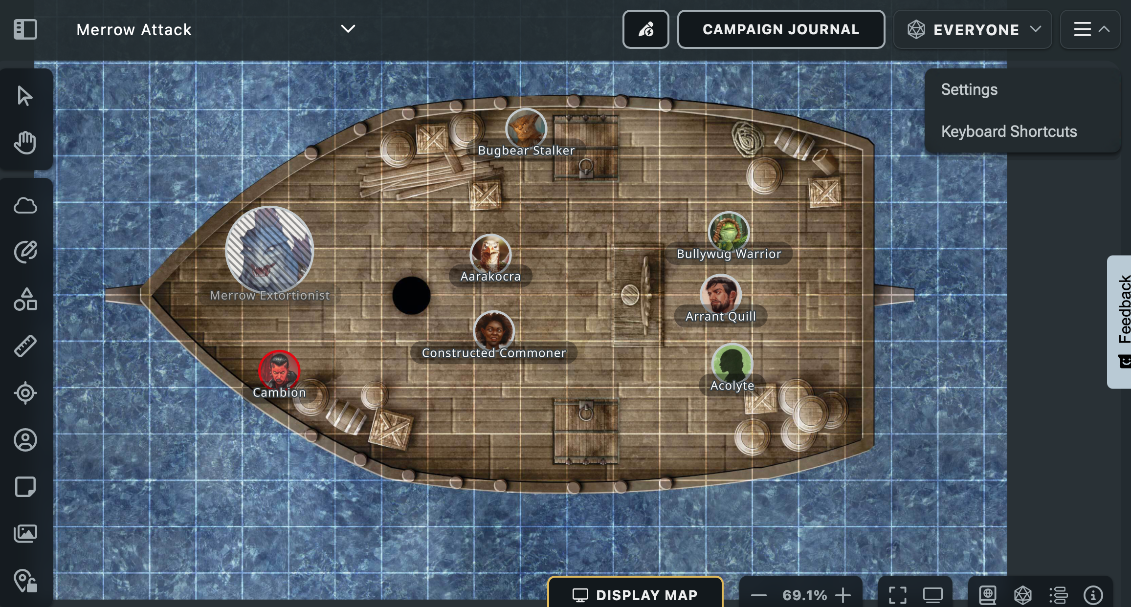
This is great. It's also a commercial product. To get all the cool maps... you need to buy the digital version of the adventure on DNDBeyond. Which means, not REALLY buying them in the same way that if I buy the adventure in book form I actually own that book.
Digital "purchases" are really just temporary licenses, and we all get to decide if we like or don't like that option for us for the money we're spending.
Sometimes I like the convenience of a digital format, and I'm willing to eat the risk of it not being a 'forever purchase'.
Since these are a commercial product on their own, driving subscribers and digital purchases... there's a financial reality incentivizing creating a single set of art that is for both the books and the VTT. And that's a problem. Because I'd argue, a dungeon map, (meant to help a DM table-run an adventure) and a battle map, (meant to work as a play-on grid) have different design goals.
A battle map should be dramatic, evocative, probably colorful, and present lots of juicy options for the players to interact with, especially in combat. Levels, hazards, hiding spots, etc. It should be rich with detail and life. Secrets, traps and non-obvious details should be hidden until revealed by the DM. It should be designed to contribute interactions for the Combat pillar of play.
Whereas a DM's dungeon map should be clear, easy to read and connect to the corresponding adventure text. It should support all three pillars of play, Combat, Exploration and Social. It should be free of confusing detail. Secrets should be clearly visible. Keyed icons and numbers should be large and contrast well with the artwork. That it should be legible is baseline requirement --you cannot "scale up" a book by pressing the + key.
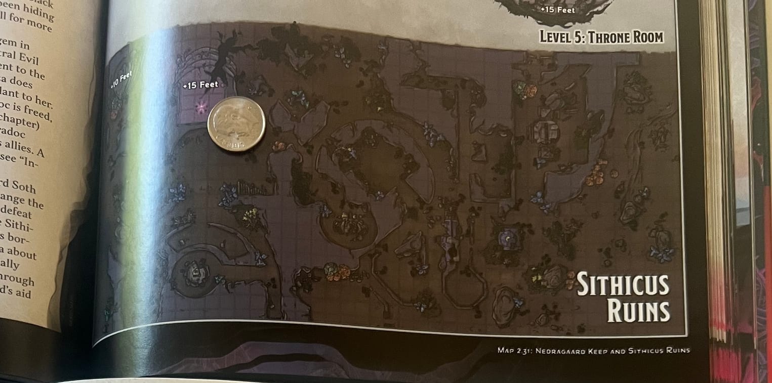
With that in mind consider the "Sithicus Ruins" from Ravenloft THW below. Looking at it from a digital photograph on a screen brightens it. The photo to the right is closer to how it looks in person.
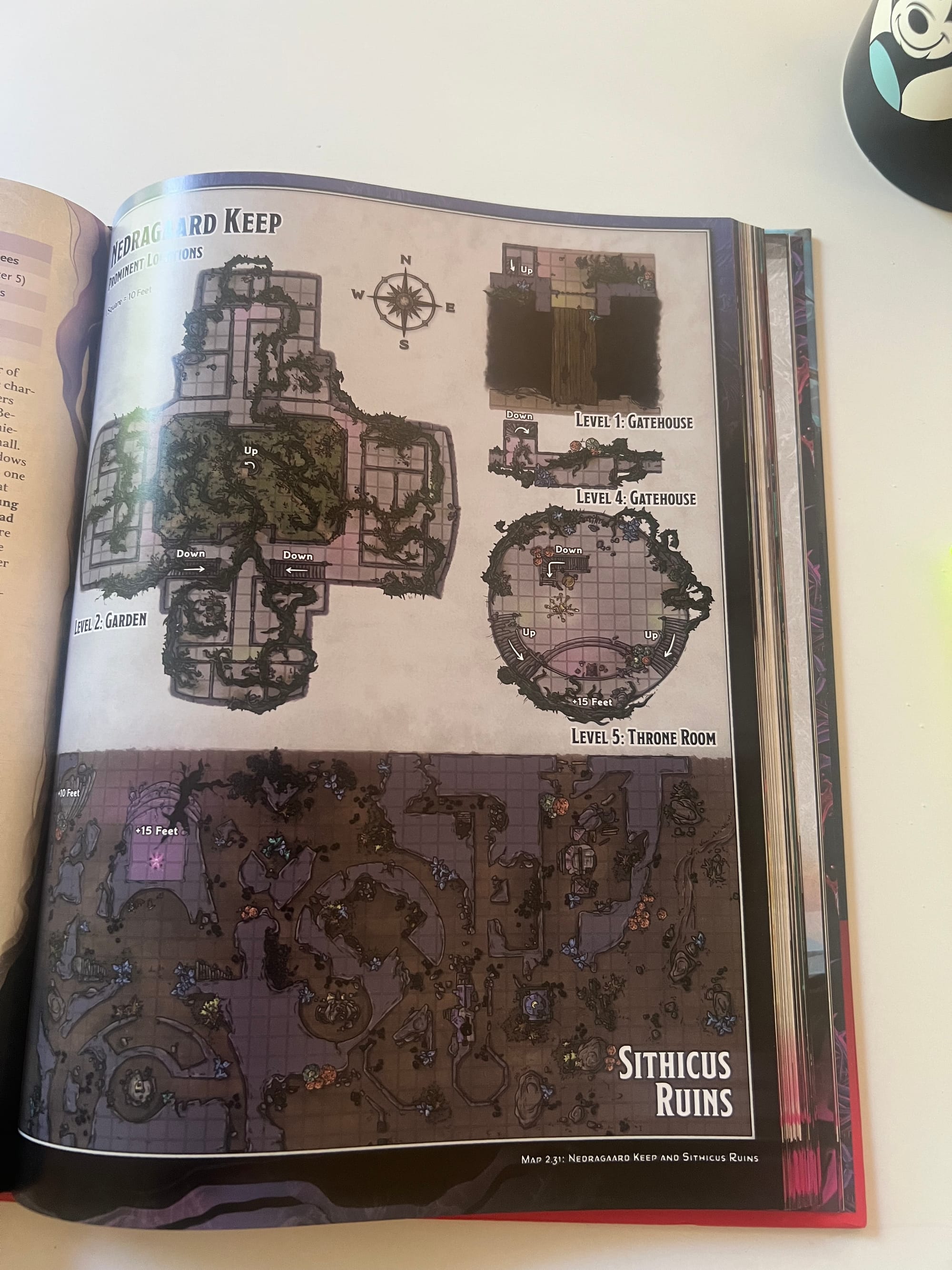
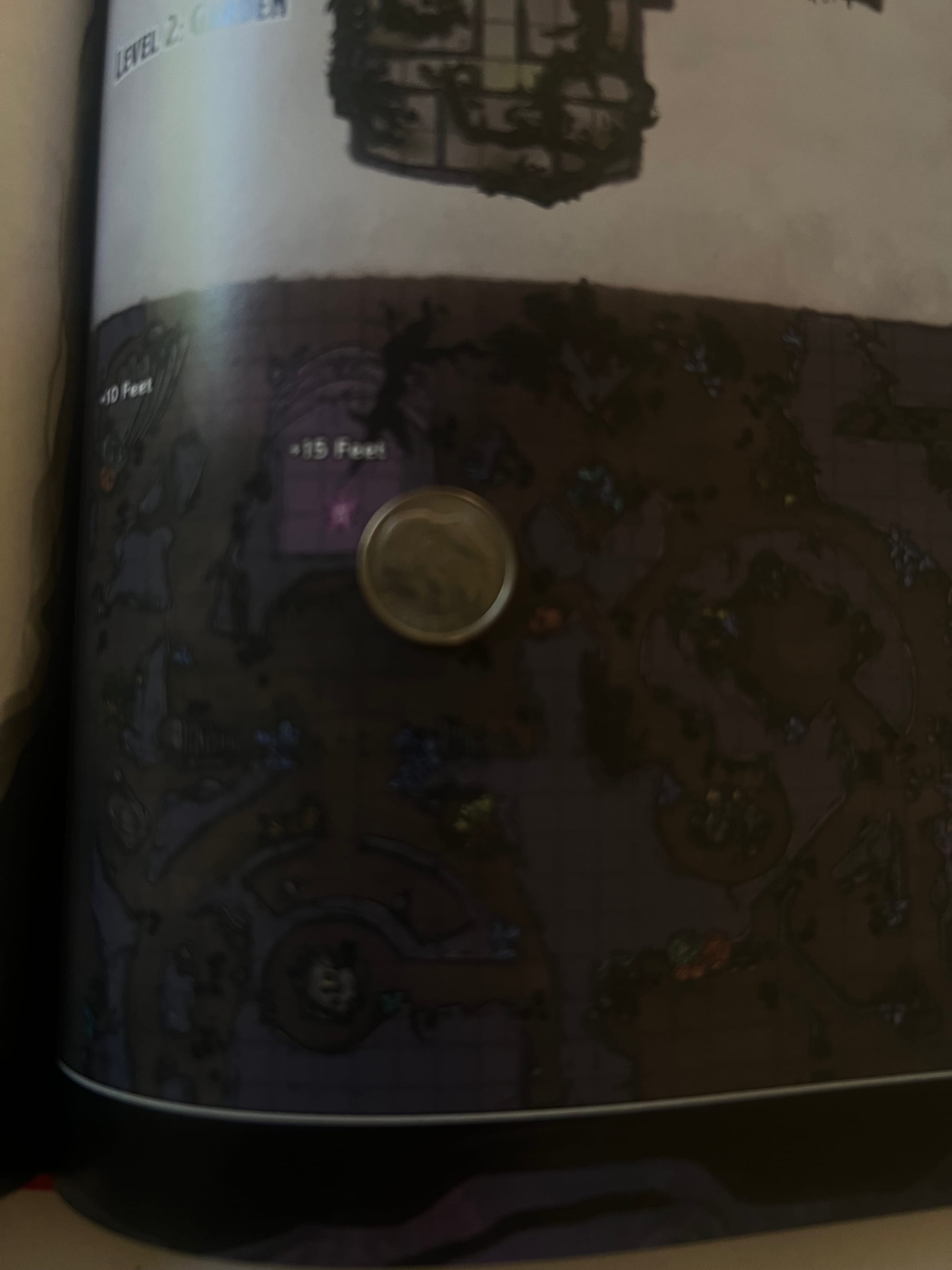
I bet this looks sick as hell as a backdrop on their VTT.
This is in no way table-usable. I cannot see it, let alone draw it live during a session. It's only marginally visible without taking a digital photo of it. Overly-complex, dark and shrunk into a small space. It's also clear that there's no attempt at looking at this from an accessibility perspective. As a Dungeon Master of a Certain Age, I want Wizards to know they have fans over 40.
'Twasn't always like this. Before "Maps", we had maps. And they were good!
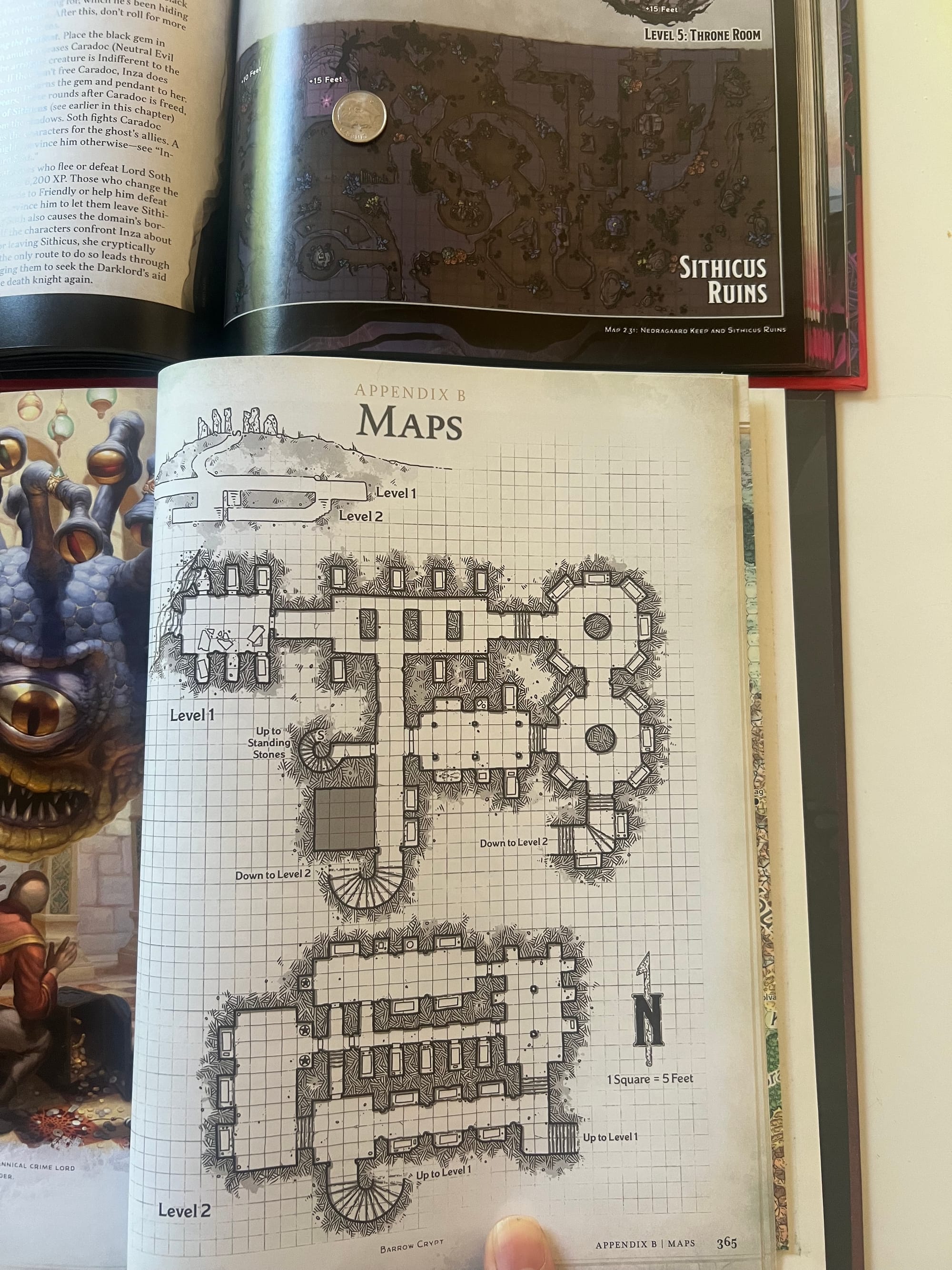
Assume you're a DM with aging eyesight. Which of these would you run?
Bottom image are maps from the 2024 Dungeon Master's Guide by the expert dungeon artist Dyson Logos.
Other telltale signs that the physical printing of these maps was at best an afterthought: Wasted page space. This shop graphic is half blank space. That cellar couldn't have filled in the page and been more interesting?
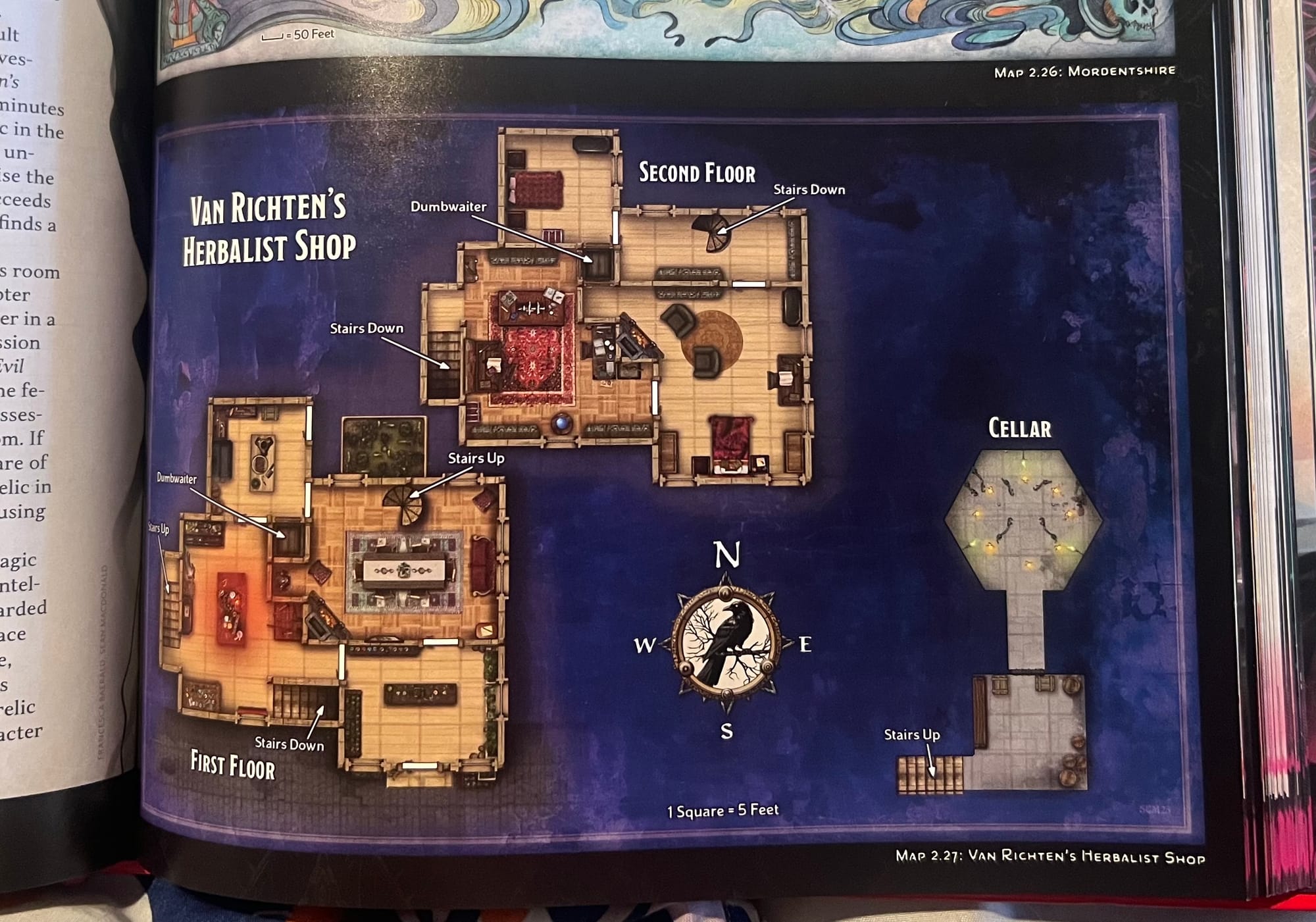
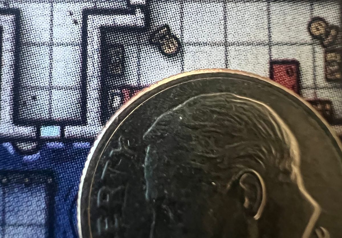
And the details are so tiny that the print version cannot even resolve them:
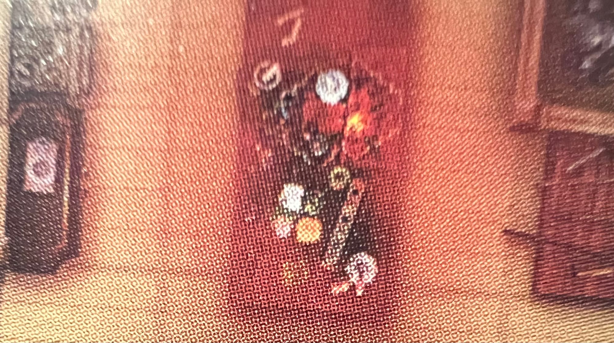
What a contradiction, details too small to resolve, and yet a third of the graphic is empty space. If only it had been designed within the space for the book, at the print resolution of the book, and not a virtual infinite scroll space.
Here's a tiny battle map, the Wreck of the Providence, tucked down in a corner of a larger map.
I would not call this a DM-map at all. There's no keyed information, there's no hidden features. There's no way to go into the hull of the ship. There's 2 sets of stairs leading up to the forecastle, but no way to go inside that space, nor indication it is a space at all. With no details to explore, it's just a battle map, meant to help players position their mini figures on top of it for combat.
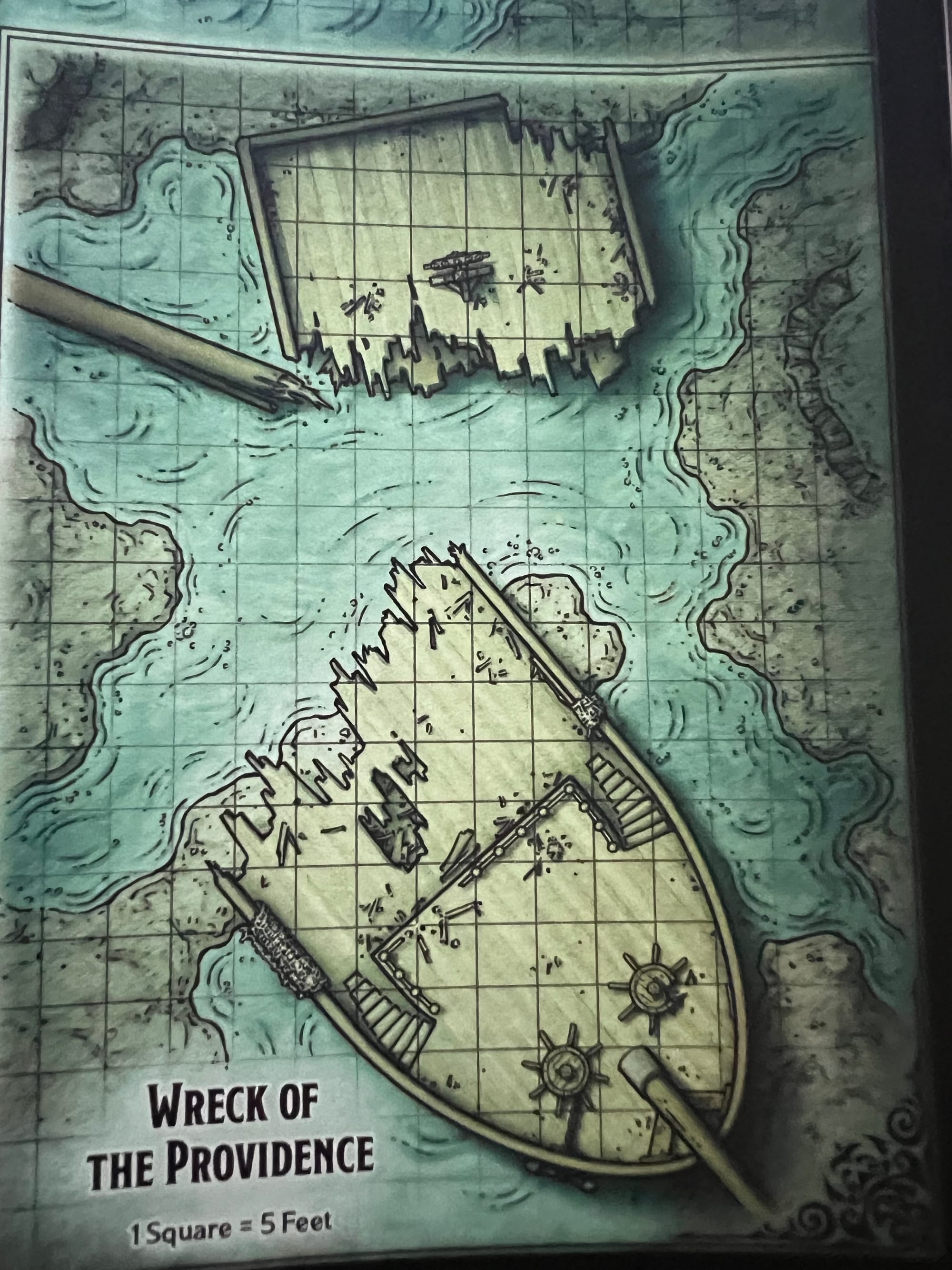
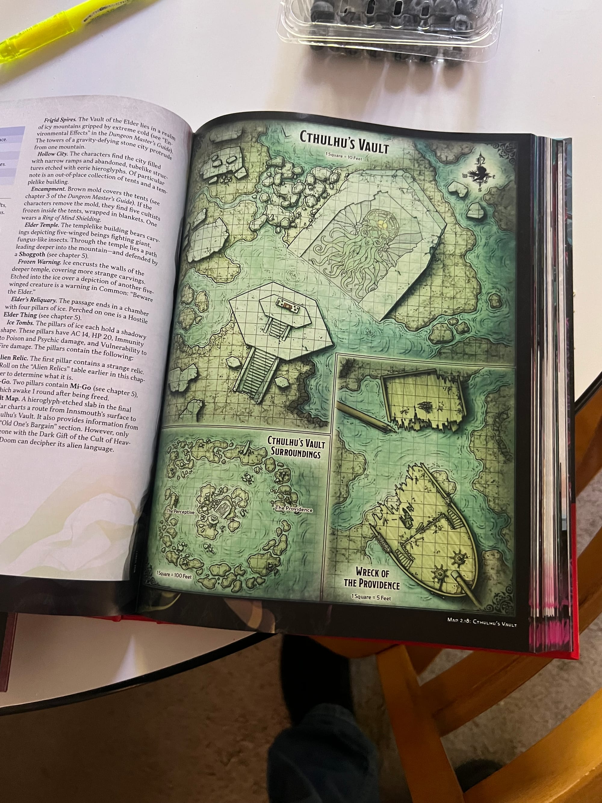
But wait, a battle map the size of your finger isn't a battle map at all. It's an advertisement for the cool ass sick battle map you WOULD have gotten if you'd bought the virtual version on DNDBeyond.com instead. Sucker!
Illegible details and wasted space abound in this book. Here there's 3 times the space taken up by decorative renderings of the Mists than the town itself:
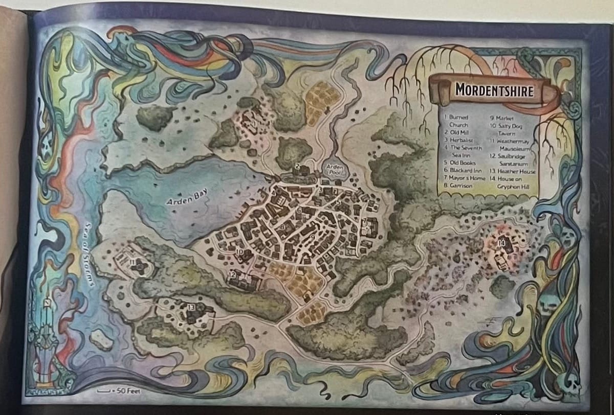
This is table unusable. I bet it looks great in the digital version though!
Chris Cocks, president of Hasbro (WotC's parent) said that he thinks D&D is moving to be more like an online service:
"But we see what's happening – almost everyone who plays D&D uses D&D Beyond, like a super high percentage uses it," Cocks continued. "A very high percentage use Foundry VTT or Roll20, and so it just makes sense that you should start to migrate your thinking about the way you play to more of a live service where you don't have to wait 18 months for us to build a book."
"Books will always be an important part of D&D," Cocks said. "It will always be kind of like a special totem that you can collect."
In that digital-first universe, where books are deprioritized as a "collectable totem", table usability of print suffers.
So why can't we have both? Both gorgeous fully-rendered detailed Maps for the VTT, and clear, well designed and easy to read and reference versions in the print version? Yes, that probably has a cost, but LINEWORK is just one layer of the illustration that was ALREADY part of the VTT drawing.
It's not too much to ask to be able to USE the maps in the books that we purchase.
Because, come-on. This is just unacceptable:
(If anyone wants to send me pictures of the maps in Deadfall, I can post a follow-up article.)